We live in a world filled with colors. It’s a part of our natural surroundings, even in an environment that’s entirely man-made. Colors hold a critical role in how we, as humans, evolved, and we associate emotions, ideas, and concepts with them. Humans use colors not just for decorative art but also for functional purposes.
However, when it comes to houses, many people think that it’s just simple decoration. But much like how it plays an integral role elsewhere, the colors in our home can also significantly impact us. And because our homes should be safe abodes, we need to be particular with how we utilize colors in our home design.
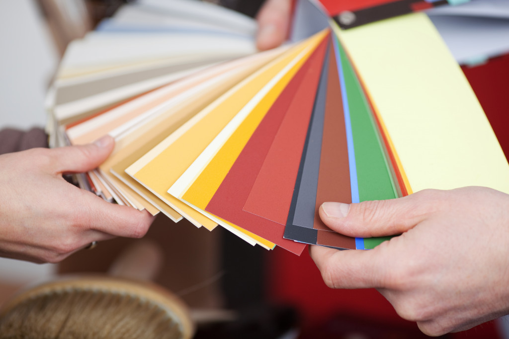
This is often why houses for sale often sport brand new paint- not just to make it look fresh but also to evoke a certain feeling when potential buyers look at the house. But let’s take a more in-depth look at how colors affect us, especially in a home setting.
Humans Have a Biological Reaction to Color
Our reaction to color isn’t just a psychological phenomenon; it’s also biological. They have a physical effect on us, as the light waves that interact without eyes vary and change depending on the color it reflects. Research shows that even though blindfold testing, a human pulse will still increase or decrease depending on the color it’s exposed to, namely red to increase it and blue to decrease it. This is proof that colors hold a bio-physical effect on humans, not just psychological ones.
We All Have Subconscious Associations to Color
Throughout our life, we all have repeated experiences that we’re not exactly the most aware of. There can even be instances of “genetic imprinting.” However, it’s more often a subconscious association, such as seeing red and orange in most fast-food restaurants, resulting in a feeling of hunger whenever such colors are present. This can also manifest differently, such as being averse to the color red after a bloody accident- all without realizing it’s due to that.

Conscious and Cultural Symbolism
Of course, if we have a subconscious association with color, we also have a conscious association. This is relatively universal, as the colors present in the natural world around us often get represented through color in artificial objects. These associations are interestingly uniform, regardless of the culture. Associations like the sea or sky are blue, fire and blood are red, and the sun is yellow- these are among the most common examples that we can even see mimicked in interior design.
Now we know what colors do to us as humans, let’s look at how colors can be utilized in home design next. Below are some common color associations and effects that interior designers take advantage of.
Attention-Grabbing and Loud: Red. If you think about attention-grabbing colors, red is probably at the top of that list. Fire engines are red, hazard lights are red, and stop signs are red; red naturally gets our attention. You can utilize this color when you want a room to be high-energy and loud. Of course, not everyone will appreciate its dominant nature, but if everyone living in your house agrees that such a color would benefit the use of the room, then, by all means, go for it.
Green for General and Natural. If you want a multi-functional color that can serve many purposes, green is the color you’re looking for.
Depending on how you utilize it, it can function- you can get the green color from plants, furniture, and a panel on the wall.
Orange for Creativity and Wonder. Orange is often associated with less serious emotions, as it’s usually used as a “childlike” color.
Most daycares would utilize the color orange predominantly, as seen in orange rubber mats in most daycare facilities. You can use oranges in your home in places where you need flashes of creativity. The kitchen, children’s play area, or even the living room are great places to color.
Blue for Calmness and Serenity. Blue is the most commonly associated with relaxation and calmness, and it’s not hard to see why. The sky is blue, the sea is blue, and both bring about a sense of ease and relaxation when we look at them. This is why bedrooms often sport the color blue on their ceilings.
Besides layout and size optimization, we also need to be aware of what kinds of colors we use for our homes. The examples mentioned here are among the most common, but feel free to experiment and discover what works best for you.